- http://www.usability.gov/what-and-why/usability-evaluation.html
- https://www.interaction-design.org/literature/book/the-encyclopedia-of-human-computer-interaction-2nd-ed/usability-evaluation
- http://www.wqusability.com/articles/more-than-ease-of-use.html
- http://www.diku.dk/~kash/papers/CHI2000_froekjaer.pdf
- http://www.wqusability.com/articles/more-than-ease-of-use.html
- https://www.nngroup.com/articles/usability-101-introduction-to-usability/
12 Oct 2020
Resources for Evaluation
11 Oct 2020
Resources and Tools for Protoyping
Part 1
- http://www.usability.gov/how-to-and-tools/methods/prototyping.html
- http://www.telono.com/en/articles/lo-fi-vs-hi-fi-prototyping-how-real-does-the-real-thing-have-to-be/
- http://www.usabilityfirst.com/glossary/high-fidelity-prototype/
- http://www.atlargeinc.com/insights/high-fidelity-vs-low-fidelity-prototyping-web-design-and-app-development
- https://www.youtube.com/watch?v=91-JnTq3MhA
Part 2
- https://uxmag.com/articles/what-a-prototype-is-and-is-not
- https://www.smashingmagazine.com/2014/10/the-skeptics-guide-to-low-fidelity-prototyping/
- http://www.usabilityfirst.com/glossary/low-fidelity-prototype/
- http://andrewchen.co/why-every-consumer-internet-startup-should-do-more-low-fidelity-prototyping/
- http://www.telono.com/en/articles/lo-fi-vs-hi-fi-prototyping-how-real-does-the-real-thing-have-to-be/
- http://it.toolbox.com/blogs/enterprise-solutions/prototyping-types-of-prototypes-14927
- http://www.usabilityfirst.com/glossary/horizontal-and-vertical-prototypes/
- http://marketblog.envato.com/grow-improve/creativity/introduction-sketch-ui-design/
- https://www.smashingmagazine.com/2011/12/the-messy-art-of-ux-sketching/
- http://www.slideshare.net/LaneHalley/how-to-draw-quick-useful-ui-sketches
- http://ui-patterns.com/blog/User-interface-sketching-tips-part-1
- https://uxmag.com/articles/storyboarding-in-the-software-design-process
- http://www.fastcodesign.com/1672917/the-8-steps-to-creating-a-great-storyboard
- http://www.slideshare.net/fgarofalo/users-story-ux-storyboarding
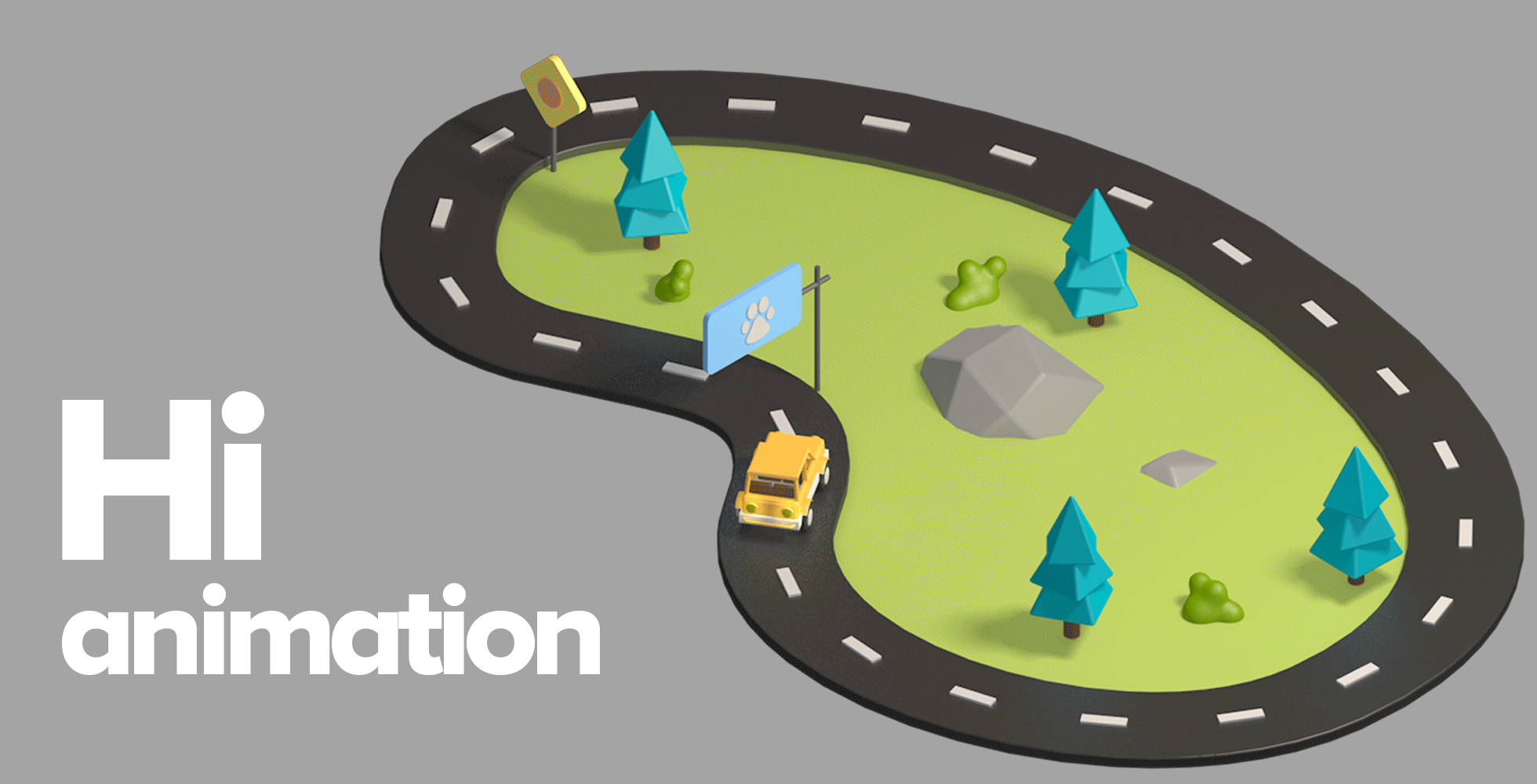
20 Sept 2020
Enhance your digital design creation with simple motion graphics
A few recomendations
- LottieFiles is a powerful extension to export your AE animations instantly as Lottie JSON, GIF, MP4, or dotLottie format for web and mobile apps for easy implementation. It saves a great deal of time. Lottiefiles is best used for vector, motion, or icon animations.
- Try Battleaxe’s AEUX extension by Adam Plouff to transfer files super easily between AE and AI, and vice versa.
Source: UX Magazine
16 Jun 2020
FREE UX design resources
(1) Mobbin.design
https://mobbin.design/
(2) Growth.design
https://growth.design/
(3) UserOnboard
https://www.useronboard.com/
(4) UI Sources
https://www.uisources.com/home
https://mobbin.design/
(2) Growth.design
https://growth.design/
(3) UserOnboard
https://www.useronboard.com/
(4) UI Sources
https://www.uisources.com/home
12 Jun 2020
25 Examples of Lead Generation Forms That Convert in 2020
All of these examples are up-to-date forms used by leading brands and I’m going to explain why each of them works so well.
This will all make sense by the time we’ve looked at a few examples.

26 May 2020
30 Mar 2020
Make Sure Your Text is Legible on All Screens
You may adjust the size of your headers (h1 tags) in either the Divi Customizer (under Typography) or module by module. To set the h2, h3, h4, h5 or h6 size, you will need to add this CSS into your child theme.
To begin with, the CSS for font sizes of headlines, which will work best on larger screens:
h2 {
font-size: 16px;
}
h3 {
font-size: 14px;
}
If you want to adjust the sizes on mobile, use this:
@media screen and (max-width:480px) {
h1,h2,h3,h4,h5,h6 {
font-size: 14px;
}
}
In my example above that would make all h tags the same height, so you may want to do this:
@media screen and (max-width:480px) {
h1 {
font-size: 14px;
}
h2 {
font-size: 12px;
}
}
etc.
BUT, what I think may make your life easier is if you use em’s. Okay, I hear you, how can that make your life easier if you don’t know what I am talking about. Here goes.
em’s are a unit of measurement. They are scalable based on the browser setting of the font size. If your browser’s default pixel size is set to 12px then 1em = 12 pixels. So 2em = 24 px or .5 em = 6px.
In my opinion, and please feel free disagree and to have at it in the comments below, it makes the most sense to use em’s when you have a gigantic headline – say 96 pixels in your hero image. On the phone that size would be ridiculous and by using an em you are scaling it to fit the mobile device.
Here is a great website that will help you convert the font sizes: https://websemantics.uk/articles/font-size-conversion/ It shows font size, em’s & %’s.
So your CSS would look like this:
h2 {
font-size: 2em;
}
h3 {
font-size: 1.5em;
}
I was asked for the CSS for font name, font weight and line height and I will add in color.
Color
color: green;
Or use the hex code #000, etc,
Underline text
text-decoration: underline;
Letter Spacing
letter-spacing: 3px;
Or use a negative in front of the number to decrease the width between letters (i.e. -3)
Line Height
line-height: 0.8; (small) or line-height: 1.8; (large)
text shadow
text-shadow: 3px 2px red;
font family:
font-family: “Times New Roman”, Georgia, Serif;
font weight:
p.normal {
font-weight: normal;
}
p.thick {
font-weight: bold;
}
p.thicker {
font-weight: 900;
}
If you would like to have your h2 tag be 24 pixels high, bold, New Times Roman and spaced out a little bit this is what you would use for your CSS:
h2 {
font-size: 2em;
font-weight: bold;
font-family: “Times New Roman”, Georgia, Serif;
letter-spacing: 3px;
}
Pain in the neck? I KNOW! The folks over at Elegant Themes have been saying for ages they are going to put all of this into the Theme Customizer. I reckon at some point it will happen.
In the interim, hope this helps. Happy designing.
(cr: https://elegantmarketplace.com/css-for-h2-h3-h4-h5-h6-for-the-divi-theme-on-mobile/)
Another read: https://www.woorank.com/en/edu/seo-guides/mobile-font-size
16 Mar 2020
11 Mar 2020
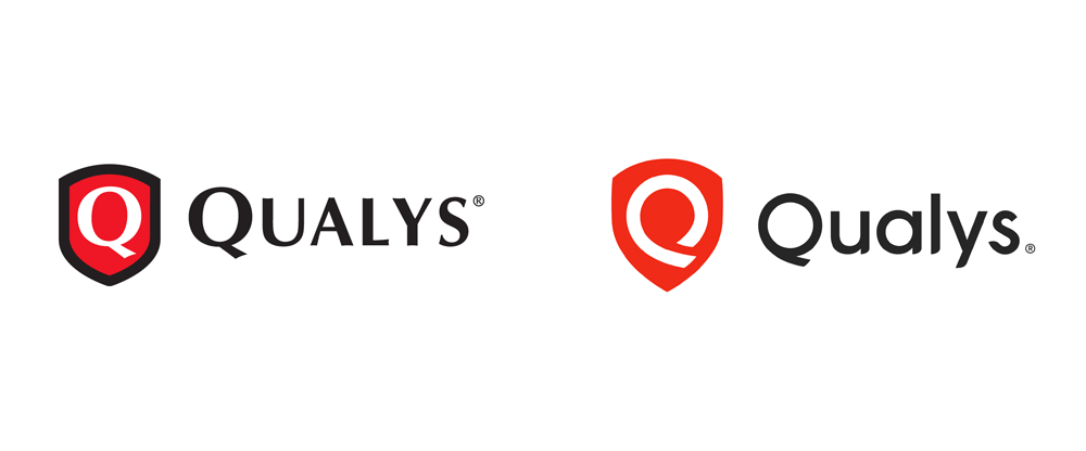
8 Mar 2020
Global Rebrand
vimeo.com/301832727
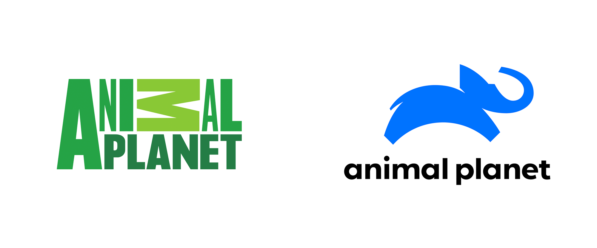
Animal Planet - by www.cghnyc.com/
---------------------------------------------------------------------------------------------------------------------
Animal Planet - by www.cghnyc.com/
---------------------------------------------------------------------------------------------------------------------
New Logo and Identity for Santander by Interbrand
www.underconsideration.com/brandnew/archives/new_logo_and_identity_for_santander_by_interbrand.php
New branding for Thomson Reuters by Interbrand
www.interbrand.com/work/a-focused-offering-drives-enterprise-grade-growth/
www.underconsideration.com/brandnew/archives/new_logo_and_identity_for_santander_by_interbrand.php
New branding for Thomson Reuters by Interbrand
www.interbrand.com/work/a-focused-offering-drives-enterprise-grade-growth/
21 Feb 2020
7 MUST HAVE Design Resources For 2020
- Free Fonts For Commercial Use https://www.fontfabric.com
- Endless Icons http://endlessicons.com
- Email Templates https://reallygoodemails.com
- Daily Design Freebies https://freedesignresources.net
- Mockups & More https://graphicburger.com
- Image Optimiser https://compressor.io
1 Feb 2020
31 Jan 2020
Daily inspiration for ui design
29 Jan 2020
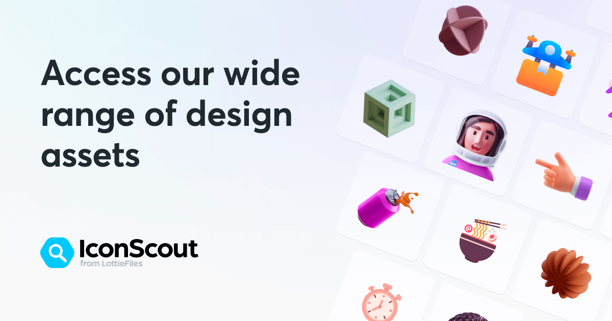
awesome tools for every UI/UX designer
IconScout
https://iconscout.com/
Highly customizable digital asset library of 4.4million+ Icons, Illustrations, 3D & Lottie animations
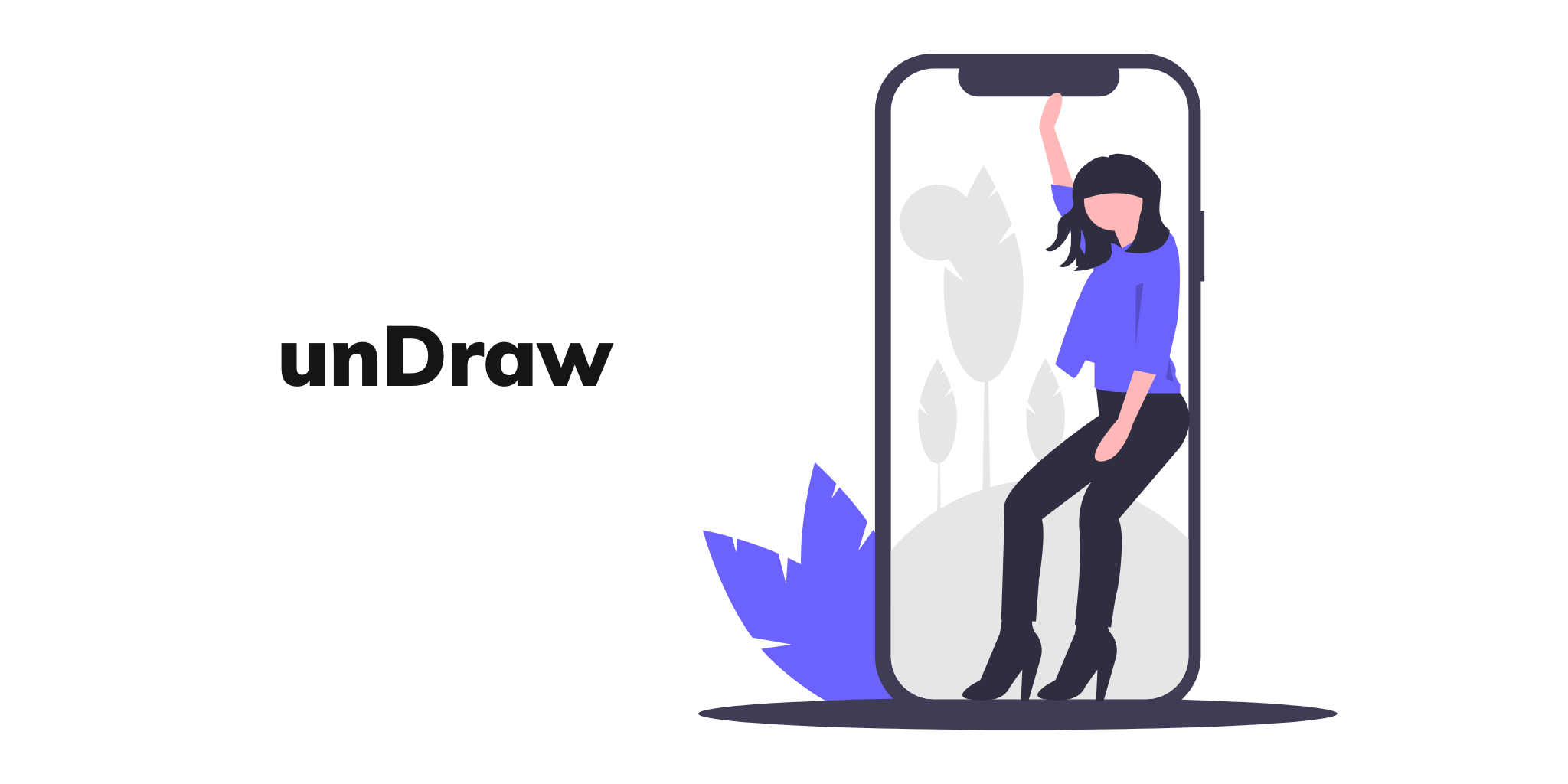
UnDraw
undraw.co/illustrationsSearch, customize, and download illustrations for free! One Of my favorite things about UnDraw is being able to change its thematic color to match your brand.
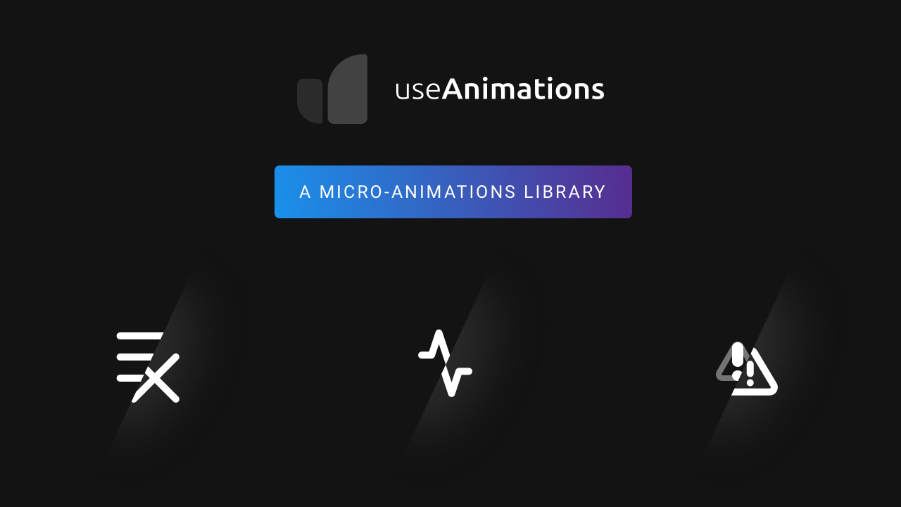
useAnimations
useanimations.comDownload and use these free animated icons that will retain quality in all device sizes, and are super easy to customize!
Subscribe to:
Posts (Atom)